Ames Housing - Part 2 - Walkthrough - An Exploratory Data Analysis
Other posts in this series:
- Ames Housing - Part 1 - Laying the foundation - Building a Data Pipeline
- Ames Housing - Part 3 - Closing the deal - Building Models
In Part 1, we built a data pipeline that cleans the Ames Housing dataset and creates new features. In this post, we explore the finalized dataset. An exploratory data analysis (EDA) is the first study of a dataset before we build models. We look at the features one at a time, then two and three at a time, to find which features affect the sale price. In Part 3, we use what we learn to build models.
Univariate Analysis: One Feature at a Time
In this section, we look at each feature by itself.
Numerical Features
First, let’s plot all the features that measure an area in square feet:
eda_plot_histograms(dfClean, vFeaturesNum[str_detect(vFeaturesNum, "SF|Area")])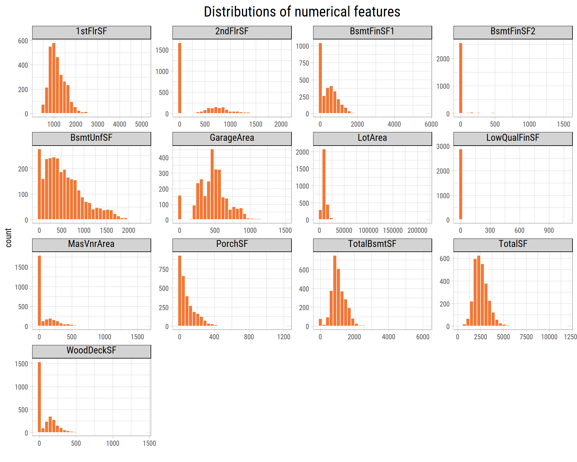
What’s notable?
- All the area features have outliers, which are values that are very different from most other values.
- Many features are very skewed: most values are small and a few values are much larger. Before we build models, we must transform these features (for example, with a log) to make them less skewed.
Now let’s look at the other numerical features:
eda_plot_histograms(dfClean, setdiff(vFeaturesNum[!str_detect(vFeaturesNum, "SF|Area")], "SalePrice"))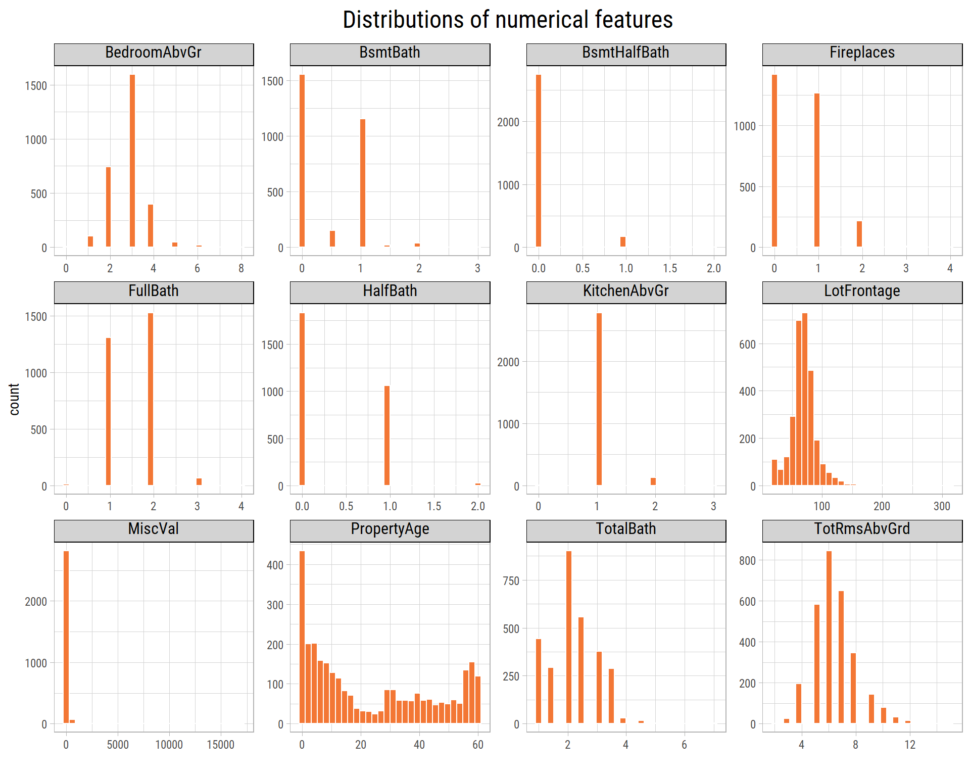
What’s notable?
- Most properties were sold less than 20 years after they were built or remodeled.
Let’s plot SalePrice on a log scale. On a log scale, each step on the axis multiplies the value by the same amount:
eda_plot_histograms(dfClean, "SalePrice", nBins = 50, xLog = T, xLabelsScale = scales::label_dollar(accuracy = 1))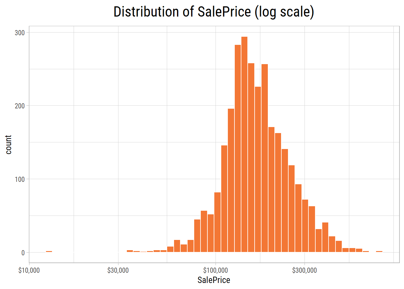
What’s notable?
- The distribution has long tails on both sides: a few properties are much cheaper or much more expensive than most.
- 11 properties cost less than USD 50,000, and 17 properties cost more than USD 500,000.
- Outliers have a strong effect on linear models.
Categorical Features
Ordinal Features
cowplot::plot_grid(plotlist = map(vFeaturesCat1, ~ eda_plot_column(dfClean, .x)), ncol = 4)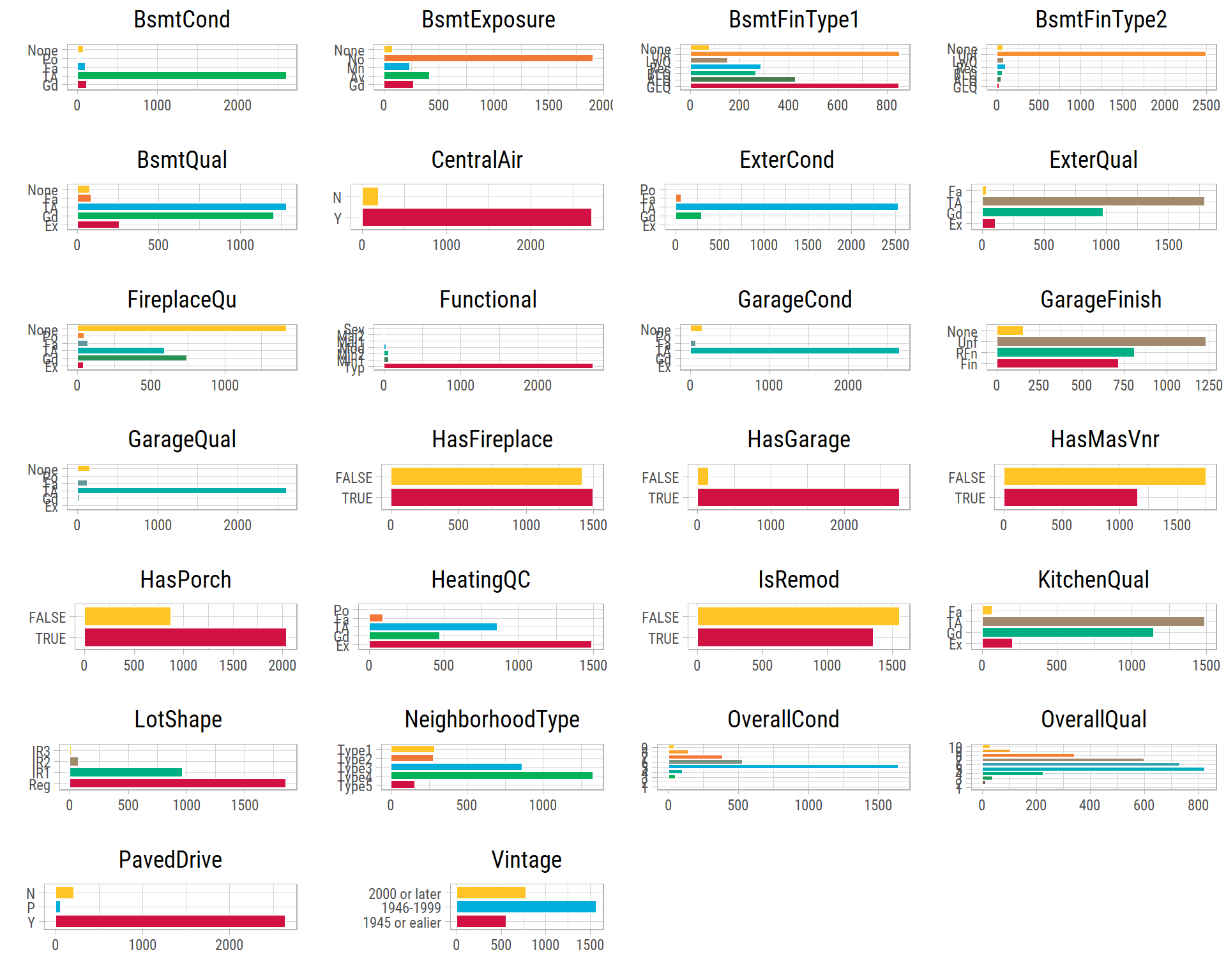
What’s notable?
- In many features, 1 or 2 categories are much more common than the others. This makes these features hard to use for predictions, because the data has only a few examples of the other categories.
Nominal Features.
cowplot::plot_grid(plotlist = map(vFeaturesCat2, ~ eda_plot_column(dfClean, .x)), ncol = 4)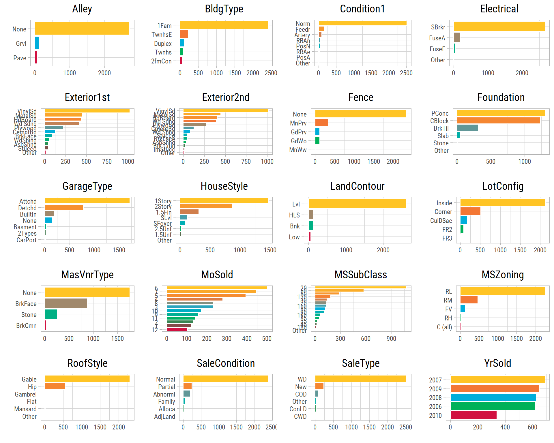
What’s notable?
- In many features, 1 or 2 categories are much more common than the others.
- Most properties are sold in the summer months, and the fewest in the winter months.
- The data shows the effect of the housing market crisis: the fewest properties were sold in 2010.
Bivariate Analysis: Two Features at a Time
Numerical-Numerical
Let’s look at how SalePrice changes with each of the other numerical features. A scatter plot shows one dot for each property, and the line shows the best straight line through the dots (a regression line):
eda_plot_scatter(dfClean, vFeaturesNum, "SalePrice", yLabelsScale = scales::dollar)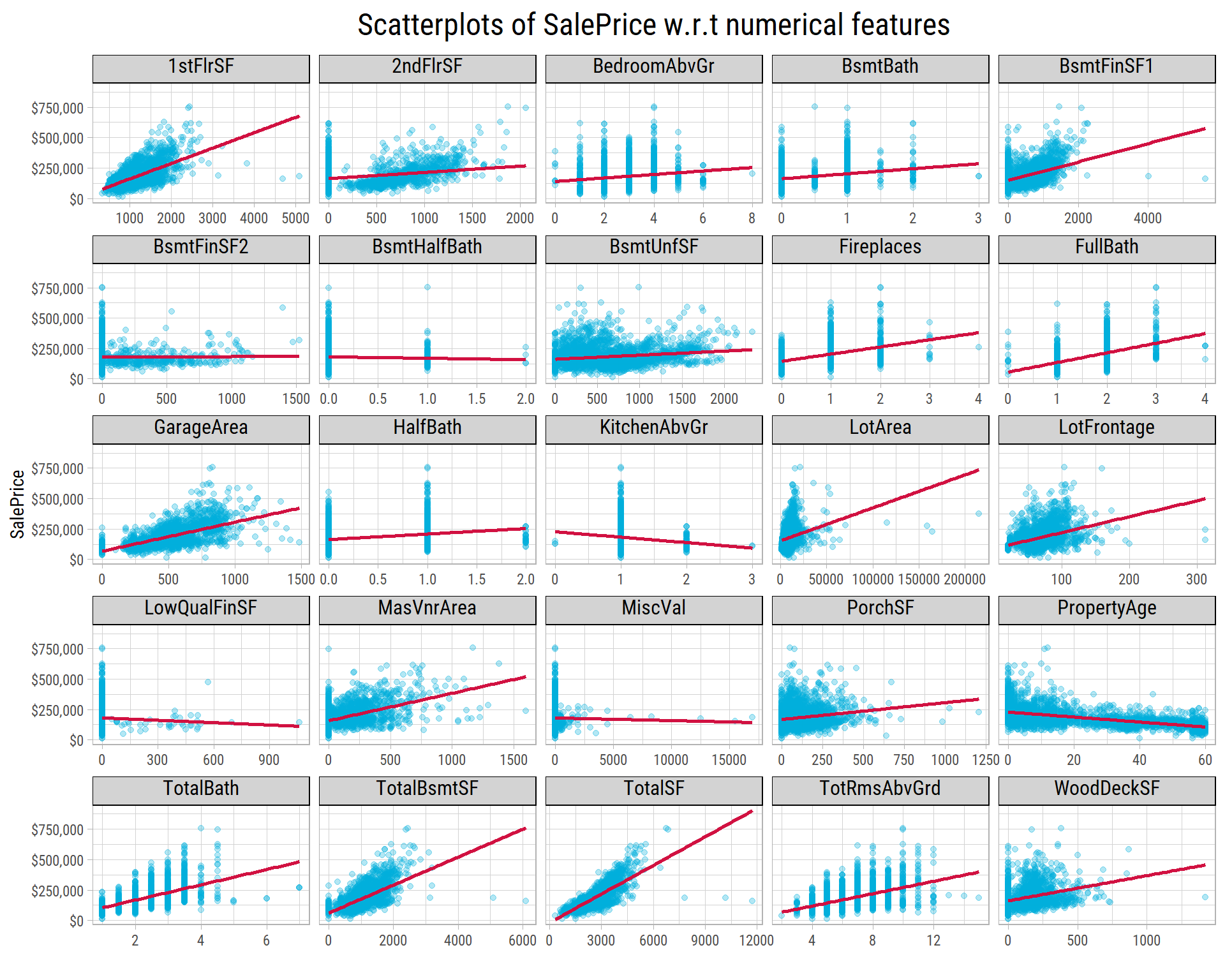
Let’s look more closely at TotalSF. The labels show the properties with the largest Cook’s distance. Cook’s distance measures how much one point pulls the regression line towards itself:
eda_plot_scatter(dfClean, "TotalSF", "SalePrice", yLabelsScale = scales::dollar,
                 nLabel = 3, feature_id = "Id", labelBy = "cooks")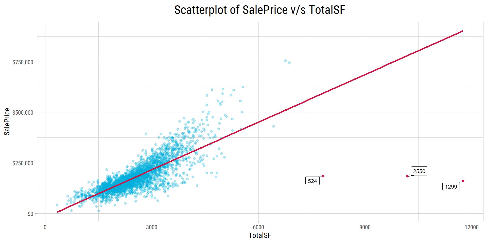
# Cook's distance of each property in a linear fit of SalePrice on TotalSF
dfInfluence <- dfClean %>% select(Id, TotalSF, SalePrice) %>% drop_na()
dfInfluence <- dfInfluence %>%
  mutate(cooks = cooks.distance(lm(SalePrice ~ TotalSF, data = dfInfluence))) %>%
  arrange(desc(cooks))

vOutliers_TotalSF <- dfInfluence$Id[1:3]
What’s notable?
- The scatter plot of
TotalSFandSalePriceclearly shows a few very large properties that sold at unusually low prices. These points have high leverage: they are far from the other points, so they pull the regression line strongly. Without them, the line would be steeper. - The same properties also affect
TotalBsmtSF. - The Ids of these properties are 1299,2550,524. Their Cook’s distances are 5.69, 2.46, 0.54. These values are much higher than the usual limit of 4/n = 0.0014, where n is the number of properties. The next property has a Cook’s distance of only 0.12. Of these three properties, 524 and 1299 are in the training set.
Transforming Skewed Features
Many numerical features are right skewed. Can we change them with a simple formula (a transform), so that their relationship with log(SalePrice) becomes closer to a straight line? Let’s compare common transforms of three features: TotalSF, the strongest area feature; LotArea, which is very skewed; and GarageArea, which is almost not skewed. Each panel shows the R-squared of a straight line through the points. R-squared is a number from 0 to 1. It tells how much of the variation in log(SalePrice) the line explains:
lTransformPlots <- map(c("TotalSF", "LotArea", "GarageArea"), ~ eda_plot_transforms(dfClean, .x, "SalePrice"))
cowplot::plot_grid(plotlist = lTransformPlots, ncol = 1)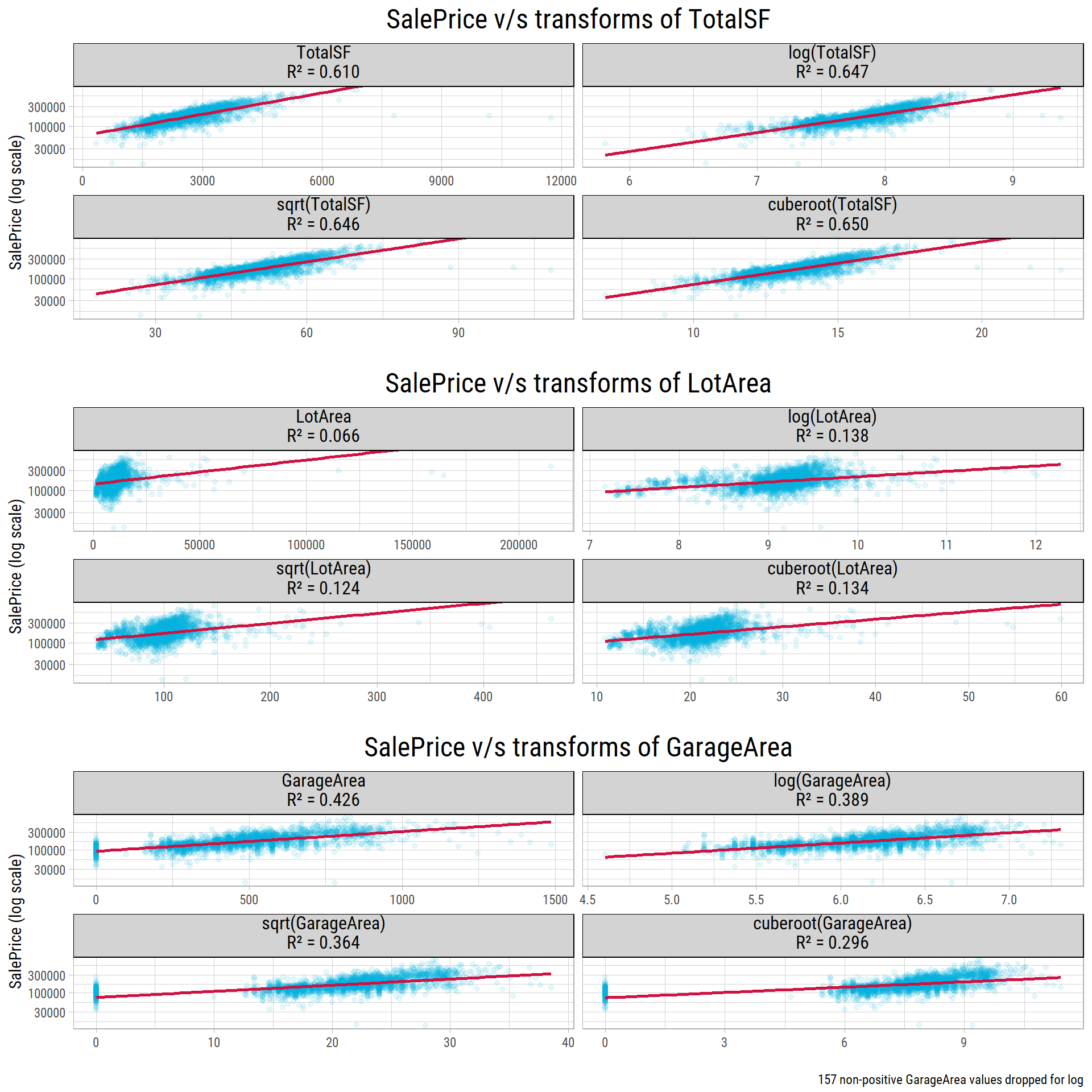
# R-squared of each transform, in the order of the panels
vR2 <- map(lTransformPlots, ~ .x$data %>%
             distinct(transform, r_squared) %>%
             pull(r_squared) %>%
             set_names(c("identity", "log", "sqrt", "cuberoot"))) %>%
  set_names(c("TotalSF", "LotArea", "GarageArea"))
r2 <- function(feature, transform) round(vR2[[feature]][transform], 3)

# skewness of each feature
vSkew <- map_dbl(c(TotalSF = "TotalSF", LotArea = "LotArea", GarageArea = "GarageArea"), ~ timeDate::skewness(dfClean[[.x]], na.rm = T))
What’s notable?
- A log transform almost doubles the R-squared of
LotArea(skewness 12.8), from 0.066 to 0.138. Without the transform, a few very large lots control the line. The log makes these large values smaller. - All the transforms improve
TotalSF(skewness 1.5) a little. With a log, the R-squared goes from 0.61 to 0.647. GarageArea(skewness 0.2) is almost not skewed, and the transforms make the fit worse. With a log, the R-squared goes down from 0.426 to 0.389. Also, the log cannot use the properties without a garage, because the log of 0 does not exist.- So, before we build linear models, we should transform only the very skewed features, not all of them.
Correlations with SalePrice
We keep the features whose correlation with SalePrice is at least 0.1 or at most -0.1. The Pearson correlation measures how close a relationship is to a straight line, so outliers and skewed features affect it strongly. The Spearman correlation uses the ranks of the values (1st, 2nd, 3rd, …) instead of the values. So it measures whether one feature always goes up (or always goes down) when the other goes up, even along a curve. If we compare the two, we can see which relationships are strong but not straight lines:
library(corrr)

dfCor <- dfClean[vFeaturesNum] %>%
  correlate() %>%
  focus(SalePrice) %>%
  dplyr::rename(feature = term,
                corr = SalePrice) %>%
  arrange(desc(abs(corr))) %>%
  dplyr::filter(abs(corr) > 0.1) %>%
  mutate(corr = round(corr, 2)) %>%
  mutate(feature = fct_reorder(feature, corr)) %>%
  dplyr::filter(!(feature %in% vFeatures_to_exclude))

vFeaturesCor <- dfCor %>% pull(feature) %>% as.character()

p1 <- eda_plot_target_correlations(dfClean[vFeaturesNum], "SalePrice", method = "pearson", minAbsCor = 0.1)
p2 <- eda_plot_target_correlations(dfClean[vFeaturesNum], "SalePrice", method = "spearman", minAbsCor = 0.1)
cowplot::plot_grid(plotlist = list(p1, p2), ncol = 2)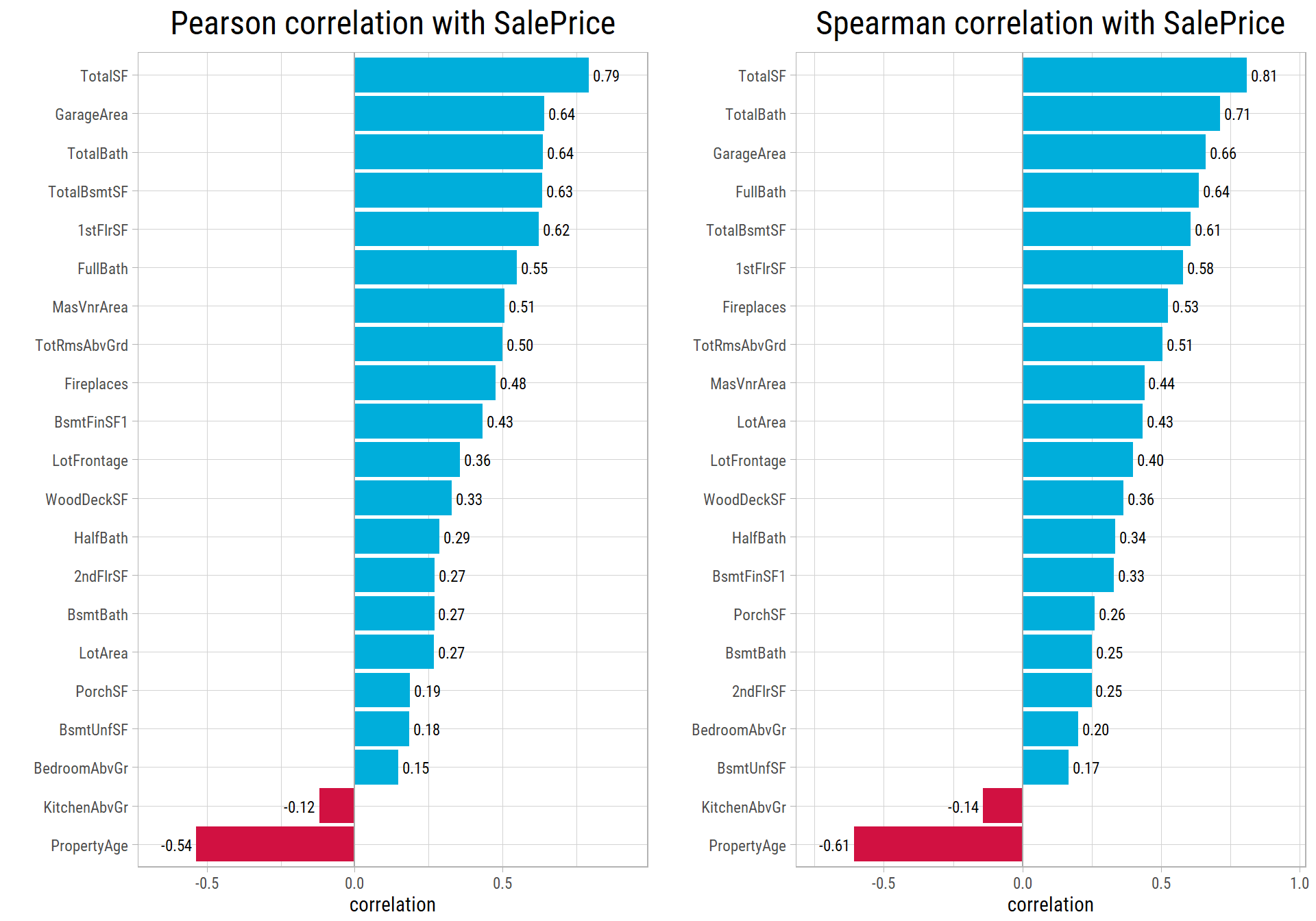
# compare Pearson and Spearman correlations
dfCorMethods <- tibble(feature = setdiff(vFeaturesNum, "SalePrice")) %>%
  mutate(pearson = map_dbl(feature, ~ cor(dfClean[[.x]], dfClean$SalePrice, use = "pairwise.complete.obs")),
         spearman = map_dbl(feature, ~ cor(dfClean[[.x]], dfClean$SalePrice, use = "pairwise.complete.obs", method = "spearman")))
cor_of <- function(feature_name, method) round(dfCorMethods[[method]][dfCorMethods$feature == feature_name], 2)
What’s notable?
- The 5 most correlated features are TotalSF, GarageArea, TotalBath, TotalBsmtSF, 1stFlrSF. A buyer would naturally look at these features to judge a property and its price.
PropertyAgehas a strong negative correlation withSalePrice. This means that newer properties sell for higher prices than older properties.- For most features, the Pearson and Spearman correlations are similar. But
LotAreais different: its correlation goes up from 0.27 to 0.43. Larger lots do sell for more, but the relationship is far from a straight line. The log transform above partly corrects this. - For
BsmtFinSF1, the correlation goes down from 0.43 to 0.33. About 32% of the properties have no finished basement, so they all have the same rank. Also, the largest finished basements have a large effect on the Pearson correlation. So the straight-line relationship withSalePriceseems stronger than the rank relationship.
Numerical-Categorical (Ordinal)
cowplot::plot_grid(plotlist=map2(vFeaturesCat1,"SalePrice", ~ eda_plot_box(dfClean, .x, .y, yLimits = c(35000,410000))), ncol = 4)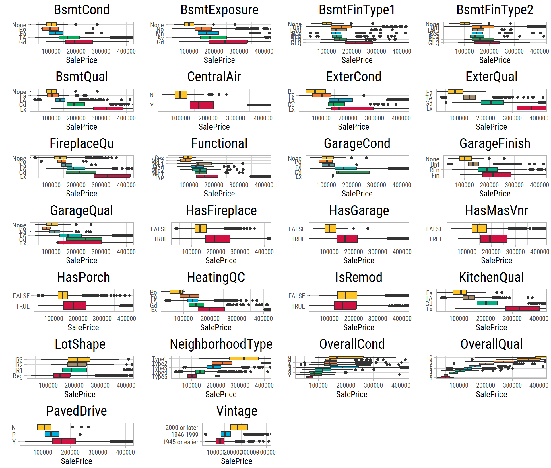
What’s notable?
- In almost all of these features,
SalePriceclearly changes with the order of the categories. - The overall quality and the exterior quality show some of the strongest trends.
Numerical-Categorical (Nominal)
Now let’s look at SalePrice for the nominal features. The categories of a nominal feature have no natural order. But if we sort the categories by their median SalePrice, we can find trends. To show the trends better, the SalePrice axis does not show the outliers. A box plot shows the middle half of the prices as a box, with a line at the median:
cowplot::plot_grid(plotlist=map2(vFeaturesCat2,"SalePrice", ~ eda_plot_box(dfClean, .x, .y, yLimits = c(35000,410000))), ncol = 4)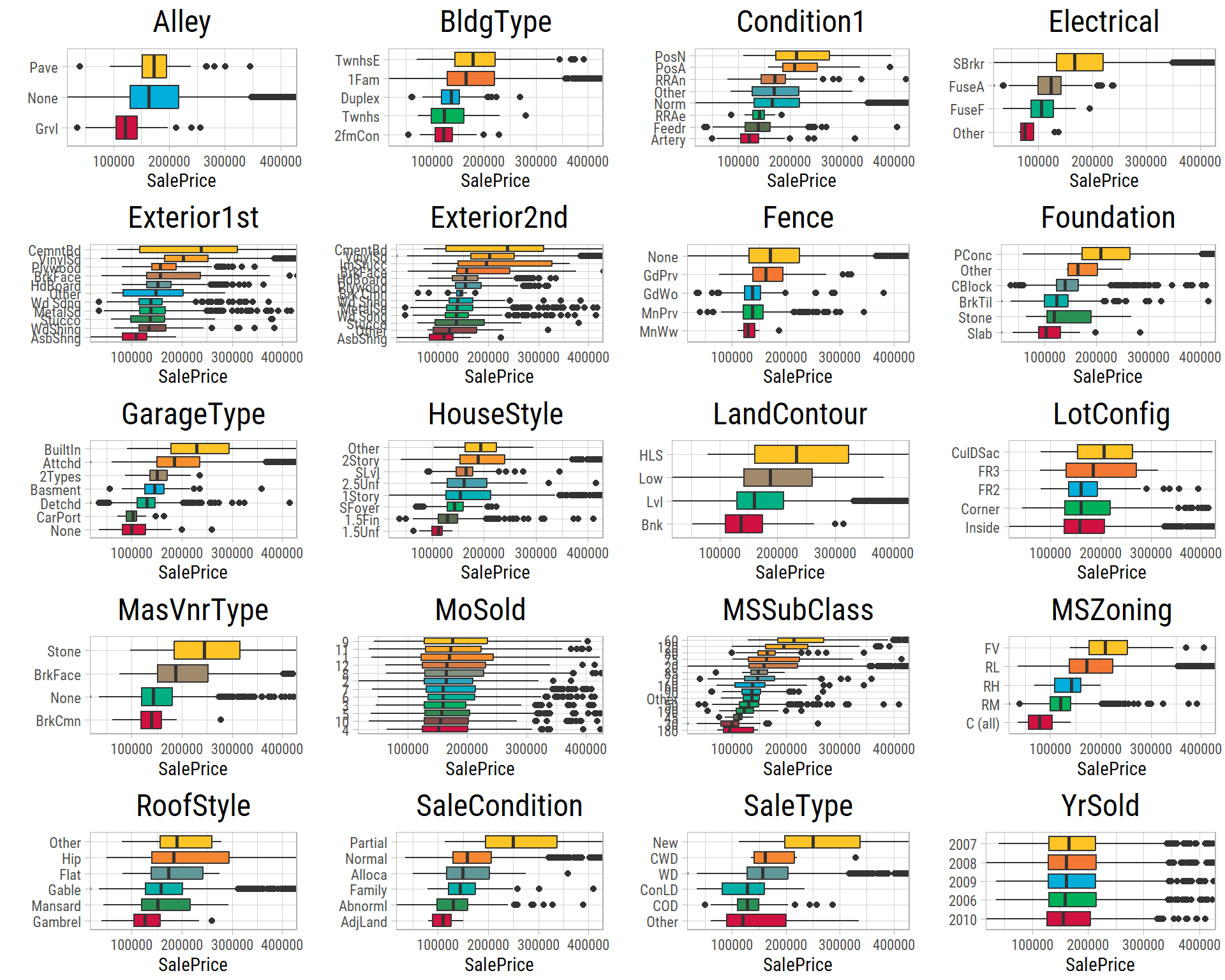
What’s notable?
GarageType: buyers prefer built-in and attached garages to detached garages and other types.- The categories of
MSSubClassshow that houses built in 1946 or later have higher prices than older houses.
Multivariate Analysis: Three or More Features at a Time
In this section, we look at how some related features change SalePrice together.
Numerical-Numerical-Categorical
TotalSF and GarageArea have some of the strongest correlations with SalePrice. Let’s see how these relationships change with NeighborhoodType and GarageType:
p1 <- eda_plot_scatter_cat(dfClean, "TotalSF", "SalePrice", "NeighborhoodType", yLabelsScale = scales::dollar)
p2 <- eda_plot_scatter_cat(dfClean, "GarageArea", "SalePrice", "GarageType", yLabelsScale = scales::dollar)
cowplot::plot_grid(plotlist = list(p1, p2), ncol = 1)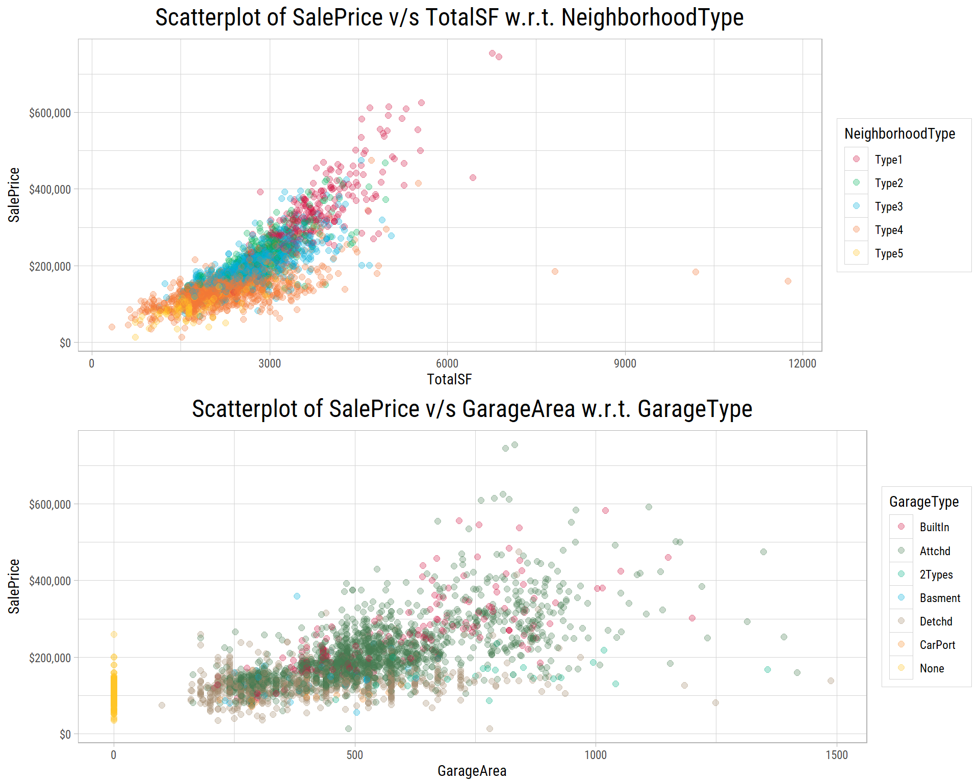
- For the same total area, properties in some neighborhoods sell for more than in others.
- The properties without a garage form a separate group.
- For the same
GarageArea, properties with built-in or attached garages usually sell for more. - So
NeighborhoodTypeandGarageTypeexplain some of the differences inSalePrice.
Categorical-Numerical-Numerical
The dots in the scatter plots overlap a lot. So let’s check these results in another way, and compare categories among properties of similar size. We split TotalSF and GarageArea into four groups (bins) with the same number of properties. Then we plot SalePrice for each category in each group. We also check whether central air conditioning (CentralAir) changes the price of properties of the same size:
p1 <- eda_plot_box_by_bins(dfClean, "NeighborhoodType", "SalePrice", "TotalSF", yLog = T, yLabelsScale = scales::label_dollar(accuracy = 1))
p2 <- eda_plot_box_by_bins(dfClean, "GarageType", "SalePrice", "GarageArea", yLog = T, yLabelsScale = scales::label_dollar(accuracy = 1))
p3 <- eda_plot_box_by_bins(dfClean, "CentralAir", "SalePrice", "TotalSF", yLog = T, yLabelsScale = scales::label_dollar(accuracy = 1))
cowplot::plot_grid(plotlist = list(p1, p2, p3), ncol = 1)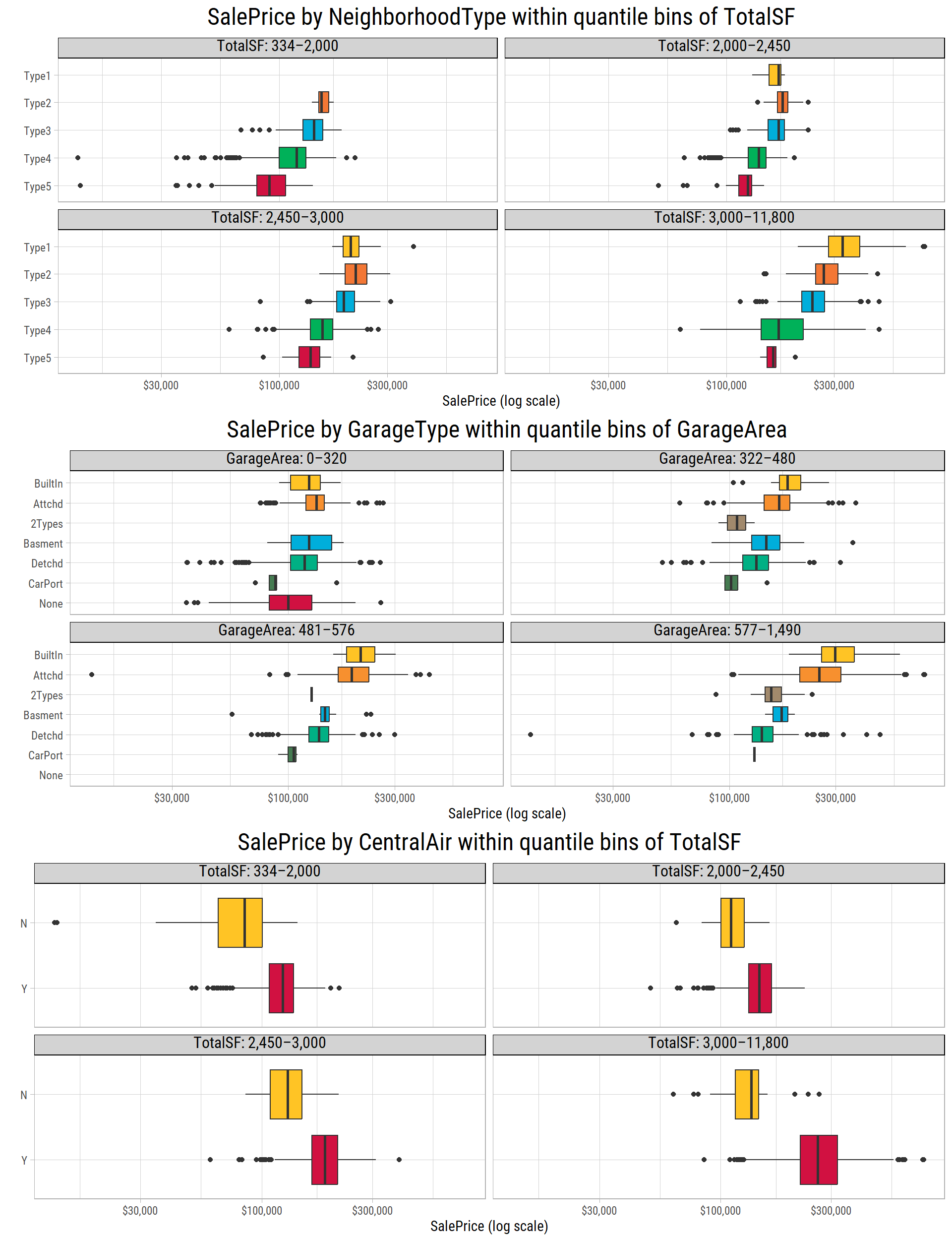
# median SalePrice by category within each bin
get_bin_medians <- function(p) {
  p$data %>%
    group_by(bin = as.integer(bin), category = as.character(x)) %>%
    summarise(median = median(y), .groups = "drop")
}
lBinMedians <- map(list(neighborhood = p1, garage = p2, air = p3), get_bin_medians)
bin_median <- function(plotName, binNum, categoryName) {
  dfMedians <- lBinMedians[[plotName]]
  scales::dollar(dfMedians$median[dfMedians$bin == binNum & dfMedians$category == categoryName], accuracy = 1)
}
What’s notable?
- The neighborhood is very important, even for properties of the same size. For the largest properties, the median
SalePricegoes from$161,000in Type5 neighborhoods to$327,000in Type1 neighborhoods. Type1 neighborhoods have few or no properties in the smallest group, so the neighborhood and the size are also related. - For the same
GarageArea, built-in and attached garages go with higher prices than detached garages. For the largest garages, the medianSalePriceis$299,018for built-in garages,$253,000for attached garages and$140,000for detached garages. Some garage types have very few properties, so their box plots are less reliable. - Properties with central air conditioning sell for more, at every size. For the largest properties, the median
SalePriceis$262,140with central air and$136,000without it.
Categorical-Categorical-Numerical
Does a combination of two categorical features tell us more about SalePrice? A heatmap answers this question. It is a grid of tiles, one tile for each combination of two categories:
p1 <- eda_plot_heatmap(dfClean, "OverallQual", "NeighborhoodType", "SalePrice")
p2 <- eda_plot_heatmap(dfClean, "GarageType", "NeighborhoodType", "SalePrice")
p3 <- eda_plot_heatmap(dfClean, "MSSubClass", "MSZoning", "SalePrice")
cowplot::plot_grid(plotlist = list(p1, p2, p3), ncol = 1)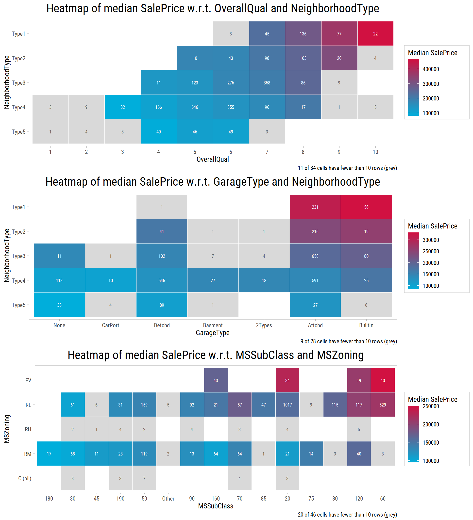
# number of combinations, and those with fewer than 10 properties
vCells <- map_int(list(p1, p2, p3), ~ nrow(.x$data))
vSparse <- map_int(list(p1, p2, p3), ~ sum(.x$data$n < 10))
Each tile shows the median SalePrice (by its color) and the number of properties. A tile is grey if it has fewer than 10 properties, because a median of so few properties is not reliable.
- Some neighborhoods have more properties with a high
OverallQual, so their prices are higher. But in Type4 neighborhoods,SalePriceclearly changes with the quality of the property. - It is less clear whether
GarageTypehas a large effect by itself. Buyers seem to prefer built-in and attached garages, butNeighborhoodTypeexplains most of the differences. - In both one-story and multi-story houses built after 1946, properties in low-density residential zones and floating village zones usually have higher prices.
- Many combinations are rare: 11 of the 34 combinations of
OverallQualandNeighborhoodType, and 20 of the 46 combinations ofMSSubClassandMSZoning, have fewer than 10 properties. So we can compare only the common combinations reliably. Also, a model would find it hard to learn how these features work together.
Next Steps
This analysis gives us several results to use when we build models:
- The total area, the overall quality, the neighborhood and the number of bathrooms have the strongest relationships with
SalePrice. - Very skewed features, such as
LotArea, should be transformed with a log before we fit linear models. - A few very large properties that sold at low prices, such as 524 and 1299, pull a straight-line fit strongly.
- Many combinations of categories are rare, so a model cannot learn them reliably.
In Part 3, we use these results to build linear and non-linear models that predict the sale price, and we compare how well they work.